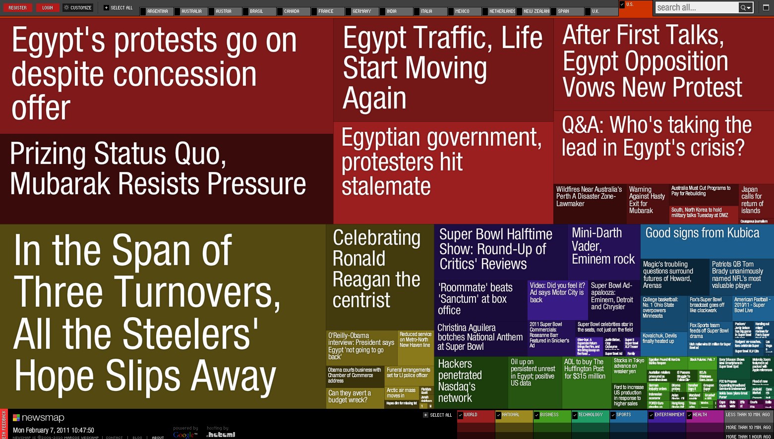
Newsmap: Your visual newsroom

Posted by Drea Avellan Categories: Design, News, Productivity,

In a connected world such as the one we live in today, we are constantly bombarded with news non-stop. This is why we sometimes need a way to distinguish what's important and current from the rest of the fluff. Newsmaps helps us visualize the world of news in a easy to understand format. This tool visualizes Google News results using a treemap visualization algorithm that helps display all the information in a user friendly way. Bigger font? Popular story. Colors? Categorize the topic of the story. Color intensity? How fresh or old the story is. We can customize our news by interest and even location. Although the colors and fonts can seem a little harsh on the eyes, it gets our attention to what is important.
Do you use a similar tool such as this? Feel free to share it with us in the comments.
Gallery: Newsmap: Your visual newsroom
Advertisement
Advertisement
© Gear Live Media, LLC. 2007 – User-posted content, unless source is quoted, is licensed under a Creative Commons Public Domain License. Gear Live graphics, logos, designs, page headers, button icons, videos, articles, blogs, forums, scripts and other service names are the trademarks of Gear Live Inc.


